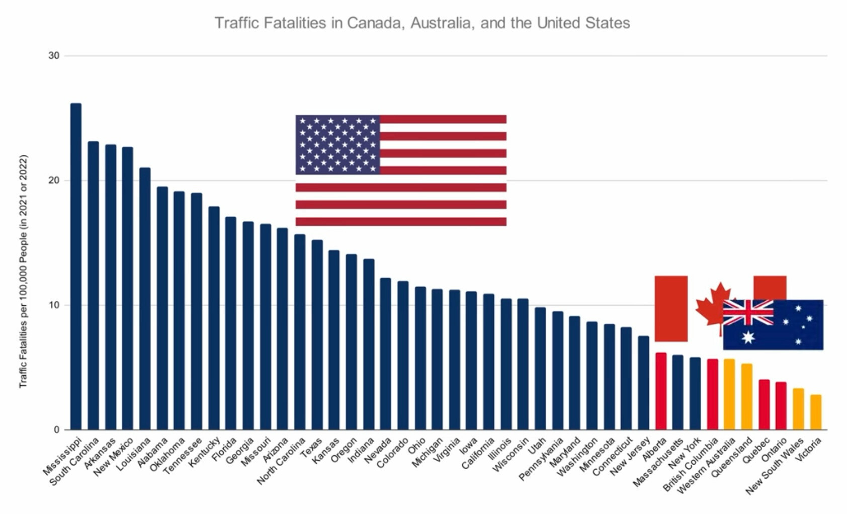
It's around 2.5 per 100 000 in Norway.
Mildly Interesting
This is for strictly mildly interesting material. If it's too interesting, it doesn't belong. If it's not interesting, it doesn't belong.
This is obviously an objective criteria, so the mods are always right. Or maybe mildly right? Ahh.. what do we know?
Just post some stuff and don't spam.
How the heck are Victorians down the bottom? Is it just the sheer size of our population keeping that number in check...?
If you can survive hook turns you can survive anything.
Also less country for country driving
There's some truth to that (wonder what percentage of fatalities are hook turn related...?), though most of my "if you can survive" experiences have been with drivers overtaking on the shoulder, overtaking in the right hand turn queue and then making a dangerous turn, losing control of their speeding vehicle in the Burnley Tunnel or on the West Gate Bridge, or deciding that stopping for red lights and/or pedestrians (crossing legally) is optional.
Obviously anecdotal, with a sample size of just one, but these are experiences I've had as a driver, passenger, pedestrian, or onlooker from a shop/restaurant/inside a tram. Didn't happen anywhere near as frequently when I lived in Sydney or Brisbane.
SOUTH CAROLINA #2!!!! 🥳🥳🎉🎊🎉🎉🎊🍻🥳🎉🎉🪅
I'm guessing gun violence is much the same.
I assume this includes pedestrians and cyclist deaths? It's by population rather than by "car" or "km driven" but I'd like to see a per county breakdown.
USA #1! 🇺🇸🦅🇺🇸
. . . Huh. Here in Vic every year we get targeted with so many ads being like 'worse year ever for road deaths, drive safe, etc'
The thing that surprised me most after moving to Oregon was how bad the drivers were. I've lived in many states across the South, the Midwest, and West Coast and I've never encountered drivers so consistently vindictive, entitled and reckless as the drivers in Oregon.
Is it the issue of safety standards?
I'm guessing there is some correlation to total miles(/km) driven. Not all of it, but some. If people in one location drive drastically less distance annually, I'd expect their numbers to show drastically lower on the chart, as well.
I am not convinced with Australia and Canada being much better? It would make sense if you were comparing to Europe.
The fact that California, a state with THIRTEEN TIMES MORE PEOPLE than Mississippi, has less than half the number of traffic fatalities is mind blowing. Mississippi is just 30% of the landmass that California represents, and yet it gets more than double the amount of traffic fatalities.
Looking at the left side of the graph, the trend is easily recognizable. Drunk angry and repressed, poverty stricken republicans will drive drunk like it's the right to bear arms. The further right you go, the more democratic the state.
