431
Road fatalities per 100,000 population in major US States, Australian States and Canadian Provinces
(lemmy.world)
Taken from: https://www.youtube.com/watch?v=JBPkI3CCY8o
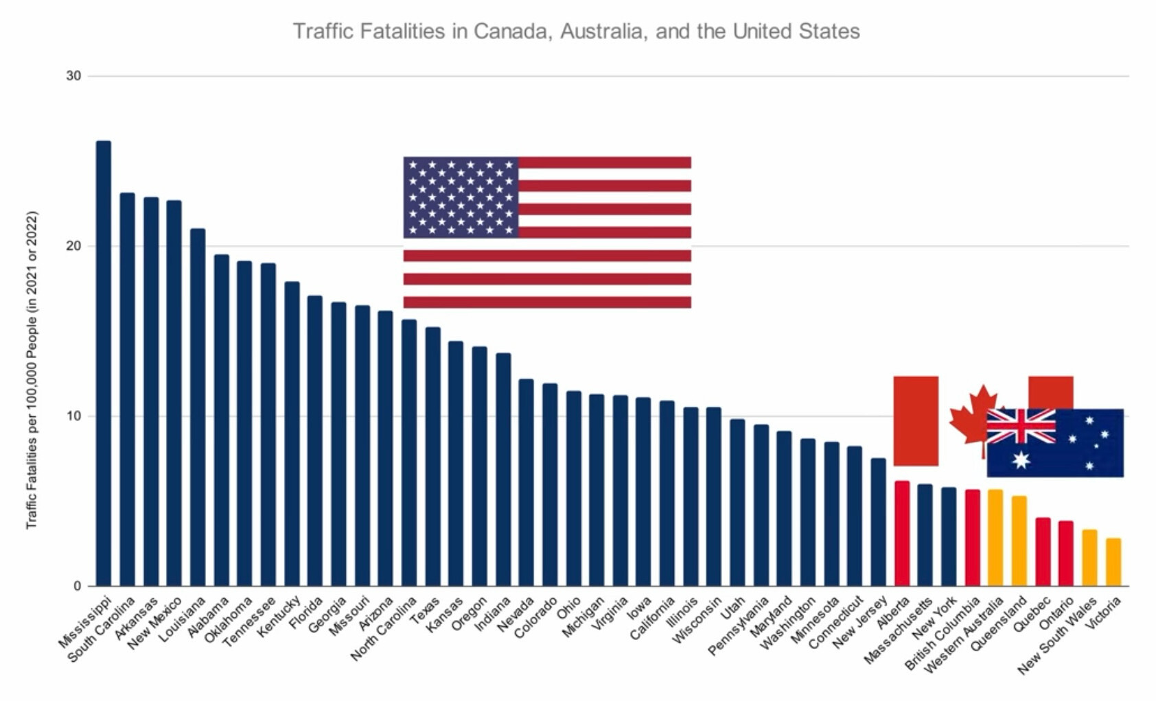
There are only 36 states represented here by my count. It says "major" states, whatever that means. But 14 in total are missing either because of their smaller populations, or because their fatality rate is low enough that they would fall off the right hand side of the chart and thus wouldn't fit the "America Drivers Bad" narrative quietly being implied, here.
Edit: I looked up the numbers for my state in the same year (and no, I'm not telling the public which one). We would be at 1.2 on this chart if my math is correct, which is well below even the shortest bar for Victoria, there.
I decided to look and found that this metric is almost always measured by vehicle distance travelled rather than by population. Basically the graph OP shared is useless and meant to support a narrative, as you stated.
I think it's kinda interesting still, in that it shows people are (must?) drive so much. But yes, agree that per cap seems like the wrong statistic for any kind of safety.
Maybe more fair would be transit fatalities per mile traveled (any method)?
Yes. The preferred method is per distance travelled.