this post was submitted on 17 Feb 2025
21 points (78.4% liked)
Data is Beautiful
5332 readers
68 users here now
A place to share and discuss visual representations of data: Graphs, charts, maps, etc.
DataIsBeautiful is for visualizations that effectively convey information. Aesthetics are an important part of information visualization, but pretty pictures are not the sole aim of this subreddit.
A place to share and discuss visual representations of data: Graphs, charts, maps, etc.
  A post must be (or contain) a qualifying data visualization.

  Directly link to the original source article of the visualization
    Original source article doesn't mean the original source image. Link to the full page of the source article as a link-type submission.
    If you made the visualization yourself, tag it as [OC]

  [OC] posts must state the data source(s) and tool(s) used in the first top-level comment on their submission.

  DO NOT claim "[OC]" for diagrams that are not yours.

  All diagrams must have at least one computer generated element.

  No reposts of popular posts within 1 month.

  Post titles must describe the data plainly without using sensationalized headlines. Clickbait posts will be removed.

  Posts involving American Politics, or contentious topics in American media, are permissible only on Thursdays (ET).

  Posts involving Personal Data are permissible only on Mondays (ET).
Please read through our FAQ if you are new to posting on DataIsBeautiful.
Commenting Rules
Don't be intentionally rude, ever.

Comments should be constructive and related to the visual presented. Special attention is given to root-level comments.

Short comments and low effort replies are automatically removed.

Hate Speech and dogwhistling are not tolerated and will result in an immediate ban.

Personal attacks and rabble-rousing will be removed.

Moderators reserve discretion when issuing bans for inappropriate comments. Bans are also subject to you forfeiting all of your comments in this community.
Originally r/DataisBeautiful
founded 2 years ago
MODERATORS
@coucouf @europesays @labplot@lemmy.kde.social @dataisbeautiful
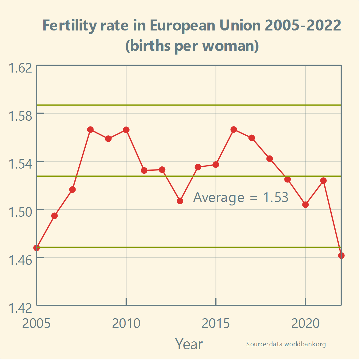
Let us reply by quoting Howard Wainer. In his well-known paper "How to Display Data Badly" he wrote:
"A second way to hide the data is in the scale. This corresponds to blowing up the scale (i.e., looking at the data from far away) so that any variation in the data is obscured by the magnitude of the scale. One can justify this practice by appealing to "honesty requires that we start the scale at zero," or other sorts of sophistry."
@LabPlot@floss.social @europesays @labplot@lemmy.kde.social @dataisbeautiful very nicely framed but unconvincing. I can reverse the argument and call it sophistry. Data visualisation inherently conveys a message and you can't avoid having to choose what you want to say. Besides most data has a confidence level so at some point by blindly applying this "principle" you're just showing noise.
@coucouf @europesays @labplot@lemmy.kde.social @dataisbeautiful
Thank you for your comment. For these types of charts describing variation in data, which also include upper and lower limits on the values that contain probable noise, not using 0 at the start on the y-axis makes sense, as it makes it easier to analyze this variation and detection of potential signals.
We believe that Howard Wainer certainly would not recommend blindly applying this principle to all cases.