this post was submitted on 06 Jun 2025
120 points (96.9% liked)

Asklemmy

48759 readers
426 users here now

A loosely moderated place to ask open-ended questions

Search asklemmy πŸ”

If your post meets the following criteria, it's welcome here!

  1. Open-ended question
  2. Not offensive: at this point, we do not have the bandwidth to moderate overtly political discussions. Assume best intent and be excellent to each other.
  3. Not regarding using or support for Lemmy: context, see the list of support communities and tools for finding communities below
  4. Not ad nauseam inducing: please make sure it is a question that would be new to most members
  5. An actual topic of discussion

Looking for support?

Looking for a community?

~Icon~ ~by~ ~@Double_A@discuss.tchncs.de~

founded 6 years ago
MODERATORS
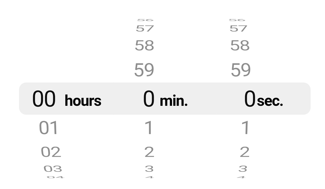
 

What are the modern design trends you hate most? Feel free to rant! Mine are:

  • Physical buttons are out of fashion, now EVERYTHING must have a touch screen instead! Especially if it makes the appliance more inconvenient to use. Like having to press a flimsy touch screen ten times to scroll through a washing machine's programs instead of just turning a physical knob and pressing a physical start button.
  • Every website looks like it's made for a phone and was vomited by the same app in slightly different flavors of vomit. And then having the nerve to tell you to download the mobile app πŸ˜‘
  • Why does everything need to be an app by the way? Especially when the only advantage the app gives you over the website is that you're not constantly spammed with messages telling you to use the app... Are you making your website shittier on purpose so I feel like I have to use the app?... I don't WANT your app, you can shove it where the sun doesn't shine.
  • Actually EVERYTHING looks like it's made for a phone... Like what's the deal with all those hamburger menus on DESKTOP software? Please just put a regular menu and same me some pointless clicking, it's not like you're lacking screen space. I especially hate that those menus can't be opened from the keyboard like regular menus. You know, "keyboards"? Those things that people on DESKTOPS use?
  • All phones look the same. All laptops look the same. It's boring as hell.
  • Laptops must be as thin and flimsy as possible. Bonus points if you can't even fit an ethernet port.
  • I'm so sick of rounded corners everywhere... 😭
top 50 comments
sorted by: hot top controversial new old
[–] pyre@lemmy.world 10 points 6 days ago

you're not complaining about "design trends", you're complaining about capitalism.

everything is touchscreen because it's cheaper than mechanical buttons.

all products looks the same because 1. it's cheaper 2. mass appeal is more profitable than niche, and 3. it's risk free

everything's an app because they can collect data, push notifications, and force you into closed ecosystems.

laptops are thin because they probably sell more as a lot of people prioritize lightweight and less bulky laptops to carry them around easier. phones are going the other way but when you're talking laptops it's kilograms rather than grams so the difference is more important.

finally rounded corners are probably a design trend, although i am generally in favor of them.

Corporate whimsy. I forget what the name coined for it was. It has bubbly oddly proportioned people and pastel colors. As an example.

[–] los_chill@programming.dev 7 points 6 days ago

Touch screens on fitness watches is the dumbest shit. I straight up can't use it while jogging and sweating. I just need a couple real buttons, but good luck finding that.

[–] Wahots@pawb.social 1 points 5 days ago

Modern construction on a budget. It uses little more than reinforced cardboard and a moisture barrier. Sometimes the cardboard isn't even glued or nailed in. So it can literally get unfolded by the wind, and suddenly the only thing preventing your house from getting water damage is a .3mm piece of plastic wrap that you HOPE the contractors didn't damage or install improperly.

Here's one such house. I don't know if it would even last a decade without significant repairs. They voided the warranty on the roof already too, so you could be out tens of thousands of dollars before you even move in.

https://youtu.be/mRuO62aNBEE

[–] otp@sh.itjust.works 56 points 1 week ago (3 children)

Webpages bouncing stuff around as various elements load in.

Back in the day, the space would be reserved, so if something hadn't loaded yet, that space would be blank.

Nowadays, you'll be reading something (or worse -- trying to click on something), and it'll get bounced around because some other element of the webpage got loaded in.

[–] Broadfern@lemmy.world 24 points 1 week ago

There’s a special place in hell for CSS flexboxes

[–] pinball_wizard@lemmy.zip 14 points 1 week ago

This trend is, incidentally, solely because we a higher percentage of programmers knew what they were doing.

It's easier to build a webpage, but more people can make them worse quality, now.

load more comments (1 replies)
[–] kersploosh@sh.itjust.works 55 points 1 week ago* (last edited 1 week ago) (7 children)

The trend toward subdued color palettes. Every new home is decorated in "millennial gray." Most cars are black, white, gray, or silver. You have to go out of your way to find bright, colorful clothing or furniture. It's incredibly boring and I can't wait for the pendulum to swing back the other way.

[–] Paradachshund@lemmy.today 28 points 1 week ago

Don't worry, it will. I'm a designer and the one thing you can count is all of us designers get bored every few years and flip things around. That's how buttons keep shifting from rounded corners to square corners every few years.

[–] tomkatt@lemmy.world 13 points 1 week ago* (last edited 1 week ago)

I hate that. I had my home built to spec a few years ago. The exterior siding is cedar shake stained a chocolatey brown with forest green trim, and the interior is white walls but with natural wood trim, pale golden laminate wood flooring, and two tone hickory wood cabinets, and the interior doors are all just natural wood unpainted.

I’ve leaned into the wood aesthetic with my DIY standing desk and custom pine desktop stained a dark red oak color, among various other earth tone color hints, and splashes of brighter decoration here and there.

Was going for β€œcozy cabin/cottage” and I think we nailed it. It’s very rustic.

I really hate the modern trends of white, black, steel, and glass.

[–] jimmux@programming.dev 12 points 1 week ago (2 children)

It's the shape of things, too. They have no character.

I was shopping for door knobs recently, because all the knobs in this house are spherical and smooth. They're impossible to grip. We have a disabled person in the house who struggles to turn them. Gloves slip right off.

At the hardware store is an entire aisle full of doorknobs, but nearly all of them are the exact same smooth spherical shape. The rest were ugly rectangular lever styles that work but look very industrial in a home that's mostly natural textures.

Somehow all these brands, finishes, locking features, price ranges, dozens of product variations, and literally only two doorknob shapes. Both so minimalist as to be almost impractical.

I had to settle for the lever style for one door, and just put grip tape on the others.

Everything being extruded, quickest to make crap is getting ridiculous. Even the expensive stuff looks like IKEA.

I miss craftsmanship and artistry.

load more comments (1 replies)
[–] stealth_cookies@lemmy.ca 7 points 1 week ago* (last edited 1 week ago) (2 children)

Most cars are black, white, gray, or silver.

I fucking hate these new vehicles with the paint that has no sparkle to it, especially the horrible grey one. So called Putty ass-whips

load more comments (2 replies)
[–] makyo@lemmy.world 7 points 1 week ago

I really thought we’d have a vibrant post pandemic β€˜roaring 2020’s’. Seems like it wasn’t handled right and so we’re sort of still stuck in the same doldrums.

load more comments (2 replies)
[–] angelmountain@feddit.nl 41 points 1 week ago (1 children)
  • All new cars look the same and are way bigger than necessary
load more comments (1 replies)
[–] Fiivemacs@lemmy.ca 32 points 1 week ago (3 children)

Everything you said.

Programs > apps (in the sense of the word)

Everything looks nearly identical online

Stupid delayed popups right where you're about to click

Websites making ANY chime/beep/noise in an attempt to direct you to their garbage robot support

Robot support

No companies having phones anymore..zero accountability.

Everything being forced to some social media garbage to tell a company how their service/product is broken and you need help

[–] phantomwise@lemmy.ml 13 points 1 week ago

Right the robot support... Especially when the only way to reach support on a website is to go through the annoying support chatbot first... and it's designed intentionally this way to increase the chances of you just giving up 😑

load more comments (2 replies)
[–] Cricket@lemmy.zip 30 points 1 week ago (1 children)
  • Completely flat chiclet keyboards on laptops. It drives me absolutely insane because I can barely tell if my fingers are aligned with the keys. Thanks, Apple!
  • Hidden controls on desktop software or desktop websites (ex: hidden exit, forward, and back controls on picture galleries)
  • Hiding or collapsing scrollbars on desktop software

In general, it seems like there's a major trend in design of form beating the heck out of function. It looks pretty! Who cares if you can actually use it or not?

[–] phantomwise@lemmy.ml 11 points 1 week ago (1 children)

I'd argue it's less "It looks pretty" as "It looks modern(TM)"...

[–] Cricket@lemmy.zip 2 points 6 days ago

You definitely have a good point!

I loath the modern obsession with minimalist, utilitarian design. Everything is just a white, black, or grey slab with no artistic thought put into its form. Buildings, homes, cars, clothes, electronic devices. It's almost like a capitalist version of brutalism. Even the design of user interfaces is usually a pile of flat, washed out rectangles now. It's like the soul has been sucked out of everything we make, reduced to it's most basic form. It can feel anti-human at times. Like the world has collectively decided that beauty is a waste of time.

[–] black0ut@pawb.social 26 points 1 week ago (2 children)
  • Rounded corners. Everywhere. They lose so much space, especially on small screens, and everything feels crammed.

  • No personalization anywhere. You used to be able to completely customize social media profiles, to the point of editing your page's CSS directly.

  • Modern OSes (except linux or BSD based ones which are not android) also have no color or personalization. You usually have the slabs of white on light mode, or the slabs of blak on dark mode, with only one color you can choose for some details.

  • JavaScript animations on every. Single. Website. I have an old phone (because I don't like modern stuff), and it struggles with almost every modern, animated site. Is it really necessary to add all that js and animations?

  • No headphone jacks or expandable storage on modern phones. It probably costs cents to add those features. I know phones don't usually have expandable storage because it makes you buy a new one once you fill all your storage, and I know they don't have audio jacks because it makes you buy the company's wireless headphones, but I need those features in my phone.

  • Why does everything have to be a web app now? Have people forgotten about actual softwate, that you own, that doesn't need internet to work, that uses almost no resources and is faster and has more features than a web app? We got everything backward. Sites that should be webs like reddit will ask you to download their apps, while microsoft will try to code Word in javascript and sell it to you as an "upgrade".

  • I hate subscriptions with passion, especially for software.

load more comments (2 replies)
[–] bathing_in_bismuth@sh.itjust.works 25 points 1 week ago (1 children)

The advantage of an app is that they can use more permissions etc to spy on you even more compared to your browser.

And don't forget the biggest plus; they can also sell your data! Isn't that wonderful?

load more comments (1 replies)
[–] charonn0@startrek.website 23 points 1 week ago

UI elements that expand and cover up other UI elements when you mouse over them.

"Flat" color schemes where you can't even tell where one UI element ends and the other begins.

Infinite scroll instead of pagination.

[–] pdqcp@lemmy.dbzer0.com 23 points 1 week ago

Car centric cities by far. Bring back walkable neighborhoods and give me options to move around instead of only being able to be stuck inside a car

[–] scytale@lemmy.zip 22 points 1 week ago (2 children)

QR coding everything. It has it uses and is practical in certain use-cases, but don't use it everywhere.

[–] JillyB@beehaw.org 13 points 1 week ago (1 children)

Maybe I'm paranoid but it also seems very insecure. I've been to some restaurants where they have the menu as a qr code and you even pay for your food from the website. What's to stop a bad actor from creating a fake version of your website and stealing card data? They just need to create a qr sticker and put it on top of the one on the table.

load more comments (1 replies)
[–] monovergent@lemmy.ml 18 points 1 week ago (3 children)
  • Light and dark modes with nothing in between. Platinum from MacOS and the default look from Windows 95 were crisp and bright without burning out your eyeballs.
  • Wasted screen space. People laugh at Japanese websites for looking too busy, but I'd much rather deal with that than scroll for ages or look for links buried 3 levels deep in a hamburger menu.
  • The idea that everything needs a backlit color LCD screen.
  • Modern standby on laptops. Sure I could just hibernate it, but that's very inelegant when S3 sleep was perfectly fine before.
  • Glued-together electronics.

The ultra-dark dark modes really bug me, black with various shades of black or dark colors is almost impossible to see UI elements on easily.

Dark modes should be like in the 50% gray area, where it's dim but things can still have good contrast.

[–] Wahots@pawb.social 1 points 5 days ago (2 children)

Out of curiosity, what is the difference between older S3 sleep and modern sleep?

Modern sleep keeps a network connection active so it can still check your email or whatever stupid reason they came up with.

[–] monovergent@lemmy.ml 2 points 5 days ago (2 children)

S3 sleep powers down all major components except for RAM. Modern sleep also keeps the CPU and network up, albeit in a low power state. It's not always executed well, hence the reports of laptops cooking themselves in a bag or draining overnight despite being "in sleep mode".

[–] HiddenLayer555@lemmy.ml 2 points 2 days ago* (last edited 2 days ago) (2 children)

Also doesn't hibernate write your RAM contents to your disk? That sounds like a great way to leak your passwords and encryption keys in plaintext. Also you need to always reserve the same amount of space on disk as your RAM and can't use that space for anything else on the off chance you might want to hibernate.

[–] monovergent@lemmy.ml 2 points 9 hours ago

Indeed. I have everything encrypted, but it's still a waste of P/E cycles, especially when combining large quantities of RAM with QLC flash SSDs.

[–] MangoPenguin@lemmy.blahaj.zone 3 points 2 days ago (1 children)

At least for windows the hibernation file is stored as a file on the C: drive, so will be encrypted by bitlocker along with your other data.

[–] HiddenLayer555@lemmy.ml 2 points 2 days ago* (last edited 2 days ago)

Wouldn't that also mean that when the file gets overwritten, i.e the next time the system hibernates, you can potentially run a data recovery program on the C filesystem to leak its previous contents since modern filesystems don't necessarily immediately overwrite the underlying data anymore, but usually just change the regions on the drive the file points to? So you could have ghost memory dumps hiding out in your free space just waiting for malware to access. You can definitely recover data from the free space of a Bitlocker volume because the encryption is transparent to the filesystem.

This is also why I don't like swap files and always disable them (or use an OS like Fedora that doesn't have them by default), because it kind of defeats the point of only storing some data in RAM for security.

I could just be ignorant of how memory files in storage are managed though.

[–] Wahots@pawb.social 2 points 3 days ago

Ah, that's exactly what mine does sometimes.

load more comments (1 replies)
[–] callouscomic@lemm.ee 15 points 1 week ago

Colors. House color options are stupid as shit. Especially if you're selling. Car color options. Why is everything so boring? Where's the teal and hot pink, and yellow with red stripes, amd rainbow, and glittery purple, and burnt orange and...

All houses are mostly beige-y white, or soft dark colors or something boring. All cars are black, white, or boring shades of blue, maybe red. No interesting shades. And then the inside of the car is like beige.

Meanwhile electronics, especially computer parts have too many fucking lights that are distracting as shit.

[–] Cherry@piefed.social 15 points 1 week ago* (last edited 1 week ago)

Smart everything. I’m buying second hand TVs simply so they are not marketing to me as soon as I turn it on.

Terms of design I feel like since postmodern we have had a bastardisation of flat design which was really mostly suited to information design but it got shoved on everything hence the monochrome blandness. On the other side we got a bastardisation of arts and crafts maybe where people tried to digitally replicate traditional methods, we got hand lettering stamping etc. then they swished them together and true design got shoved out the window in favour of , how can we grab the users attention, to
how can we hold the viewer captive, to
How can we force the viewer to absorb, to The how can we annoy the viewer so much they will pay to just read/view in peace.

I am not sure what this design movement will be called

[–] daggermoon@lemmy.world 13 points 1 week ago (2 children)

Electronics that are damn-near impossible for anyone but a professional to repair.

load more comments (2 replies)
[–] Oberyn@lemmy.world 13 points 1 week ago (2 children)
  • Giant fucking (landing page img|carousel)s
  • Cutesy (error msg|splash screen) illustrations
  • Camera bumps . Wanna lay your phone flat ? Requires case now !
  • This stupid fucking thing :
load more comments (2 replies)
[–] tomi000@lemmy.world 13 points 1 week ago (2 children)

Big phones. Why wont they produce anything that fits in one hand anymore?

load more comments (2 replies)
[–] thesohoriots@lemmy.world 11 points 1 week ago (2 children)

Corporate Memphis, and I’ll get ahead of the curve, whatever its successor is. Probably some kind of AI-chic.

load more comments (2 replies)
[–] borokov@lemmy.world 11 points 1 week ago

Prompting.

Remember the day where you have to type commands on a terminal to do anything and some guy came up with "button" and "windows" and suddenly you could print yo document with a single click ?

Oh, cool, let's bring back the trend of speaking to your computer through a text area !

Fuck LLM.

[–] twice_hatch@midwest.social 10 points 1 week ago (1 children)

Actually EVERYTHING looks like it’s made for a phone…

Most people don't use computers :(

I think the number of computer users stayed about the same, and the biggest Eternal September wave has seen at least 10x as many people getting online phone-only

load more comments (1 replies)
[–] Moonguide@lemmy.ml 9 points 1 week ago (4 children)

I'm a graphic designer, so maximalism and antidesign. It's taking a bit to become more than just a trend, but it's getting there. I understand minimalism is getting stale, but the answer is not going for something hard to read. Even with proper hierarchy the sheer clash of colors, sizes, etc., will lead to a jumbled mess. Form follows function to make life easier.

A balance must be struck between maximalism and minimalism.

load more comments (4 replies)
[–] HiddenLayer555@lemmy.ml 9 points 1 week ago* (last edited 1 week ago) (1 children)

The home, back, and switch app buttons on Android being replaced with that bar like on the iPhone.

I especially miss the back button, swiping from the edge of the screen is nowhere near as ergonomic. It also replaced the ability to reveal the side panel by swiping from the left edge, so now you have to tap the hamburger menu way up at the top left corner of the screen for it, which requires either your other hand or you have to shimmy the phone down your hand until you can reach it.

Also, when you have a full screen video playing, you have to swipe up once to reveal the bar, and then again to actually close out of the app. That made sense with buttons but why the hell is it still the case with the bar?

Double tapping the switch app button to switch between the two most recent apps was also more convenient than swiping up to reveal the app manager and dragging the window to the right, and when you want to go to the previous app, whether it's on the right or left side of the current one seems to depend on how long you've been on the app for, which means you can never build up muscle memory since it changes all the time.

Another case of Google trying to imitate Apple's UX but seemingly not actually doing any of the usability testing and polishing that Apple does, and generally making it both worse than Apple's implementation and worse than what was there before.

[–] Trev625@lemm.ee 10 points 1 week ago

You can bring back the old control scheme! You can even flip it which my gf uses cause it's easier for her to reach.

[–] SaneMartigan@aussie.zone 7 points 1 week ago

Interrupted garden paths. Like stepping stones in lawn. Just put a continual path. Stepping stones are terrible for access and maintenance. Just grass or just paving would be preferable.

load more comments
view more: next β€Ί